D3 Projects.
Some of these may be buggy as I'm currently updating and rewriting parts of them. Some of these lack some polish due to the tight deadlines in the course. Additionally, I would like to clarify that the assignment requirements were to represent every parameter of data in the data source visually, not to represent the data in some way that exposes a specific connection. As such, the latter two of these visualizations are more cluttered than they would actually be if one were visualizing these datasets for a client.
Vis 1
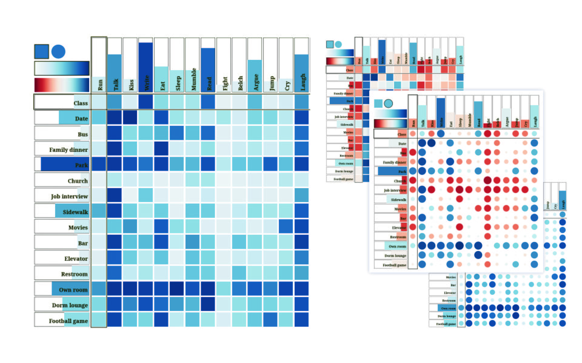
This project visualizes data from a 1974 paper where 52 undergradautes were asked to judge the appropriateness of 15 behaviors in each of 15 situations. The data is represented as a matrix where rows represent situations and columns represent behaviors. The values may be represented by saturation and size and it is possible to switch from a single color gradient to a two color gradient with the buttons in the top left corner. Clicking on an entry will bring it to the top left corner and sort all other rows and columns based on similarity.
I was not aware while making this visualization but I later learned that this technique of reorganizing data in this way was originally developed by Jacques Bertin in the 1970s as a "reorderable matrix" where rows and columns were physically moved by hand.
- data-activity.csv
- A CSV containing the dataset for this visualization.
- Rewrite event handling to use d3-dispatch
- Overlay data on mouseover
- Add a 'reset visualization' button
- Add support for using other measures aside from Euclidean distance (eg. the Pearson correlation coefficient)
- Refactor the functional components of the code into a D3 package and upload to github
- Add more Bertifier-like features
Vis 2
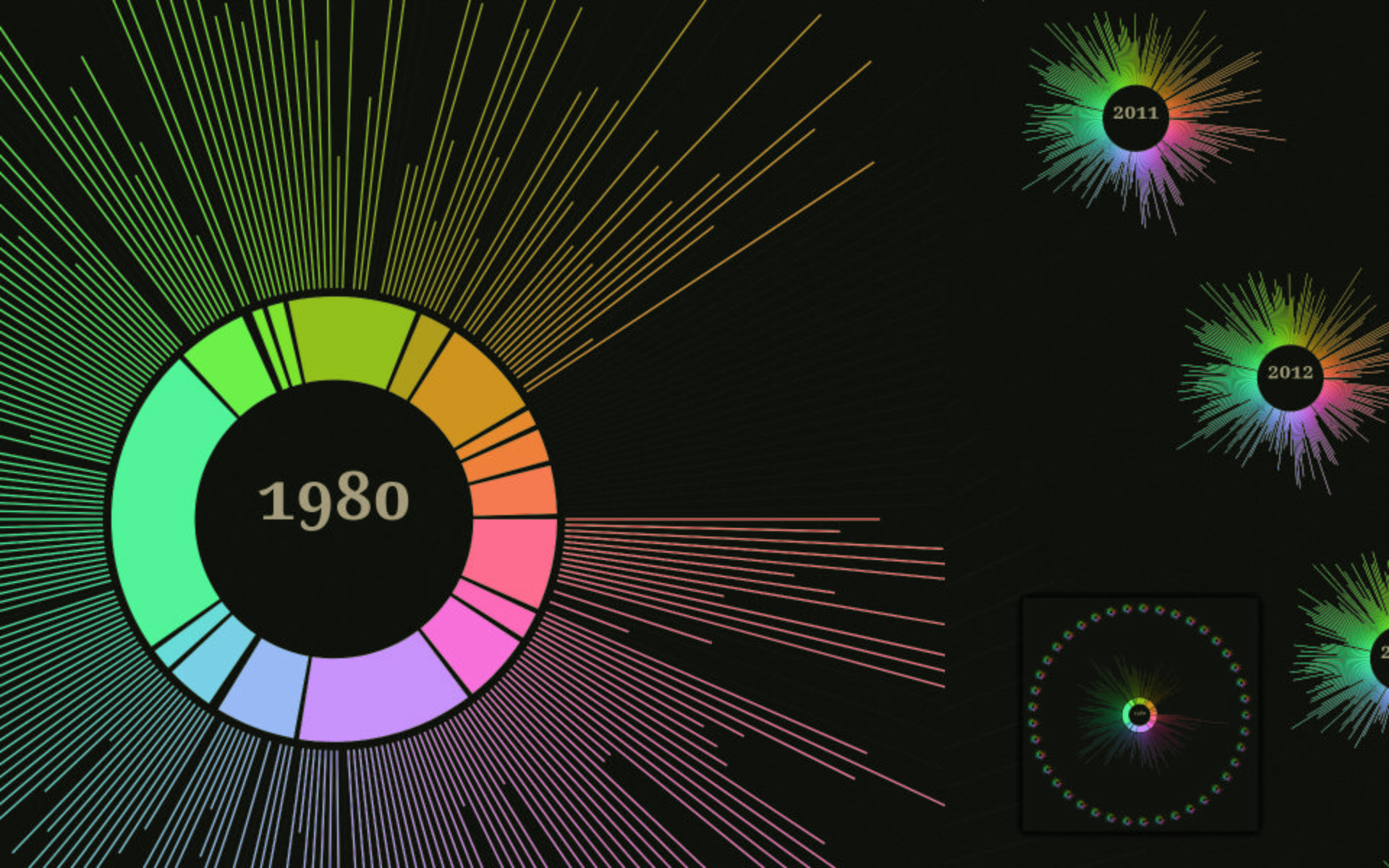
This visualization uses data from a UK national survey that collects food consumption data from participants who maintain food diaries. The food is broken down into various categories and it spans many years. The dataset is very large so I decided to create very simplified representations where each category of food is represented by a different color and the quantities are represented by circular barcharts. This allows a viewer to see what is essentially a thumbnail for each year and quickly identify years with anomolous "shapes" and see how the shapes seem to change.
A large representation of the currently selected year is represented in the middle and mousing over different elements will show tooltips with more detailed information. Small simplified representations lie around the large representation and clicking on them selects that year to be shown in the center.
- labels.csv
- test
- years.csv
- test
Vis 3
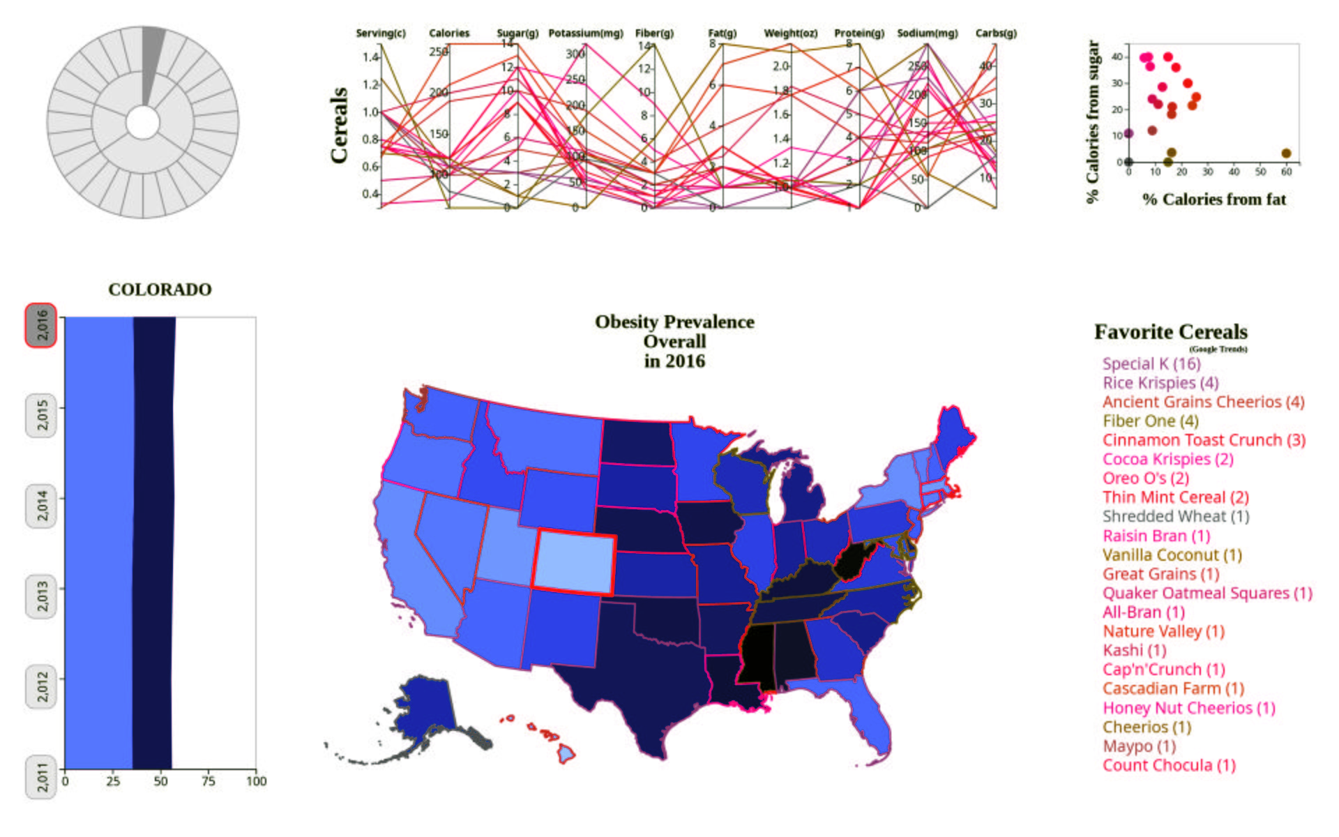
This project is a dashboard that combines datasets from several large databases. The main information sources are very detailed Body Mass Index (BMI) information from the CDC's Behavioral Risk Factor Surveillance System (BRFSS), additional BMI, poverty, and exercise data by state, cereal nutrition information obtained from consumer reports, and favorite cereals by state obtained from Google Trends. The datasets are very large and contain breakdowns for different demographics according to gender, age, race, education level, and income.
Almost every part of the dashboard is interactable. A user is able to click on a state to see data specific to that state on the left, they are able to select a year to see how the map looked at the time, the dial on the top left is used for selecting different demographics. The list of cereals on the right is reordered according to which cereal is currently selected and selecting a cereal will highlight it on the map, on the graph in the upper right, and on the parallel coordinate chart above showing nutrition information.
- 10m.json
- Map data in topojson from census bureau data compiled by Mike Bostock.
- state-id.dsv
- Census bureau data listing FIPS and USPS codes for each state.
- cereal.csv
- Cereal data, compiled from different sources.
- cereal_extra.csv
- Extra cereals, manually gathered by me.
- obesity_poverty.csv
- Poverty and exercise data by state, not yet implemented.
- favorite_cereal.csv
- Google Trends data, compiled by BusinessInsider.
- favorite_cereal_fb.csv
- Alternate list, cereal by Facebook Page Likes by state, compiled by Movato, not yet implemented.
- BRFSS__Table_of_Overweight_and_Obesity__BMI.csv
- HUGE, from BRFSS webpage.
- fn2i-3j6c.csv.csv
- HUGE, from BRFSS socrata SoQL API, slightly different from above, not used except for sanity checking.